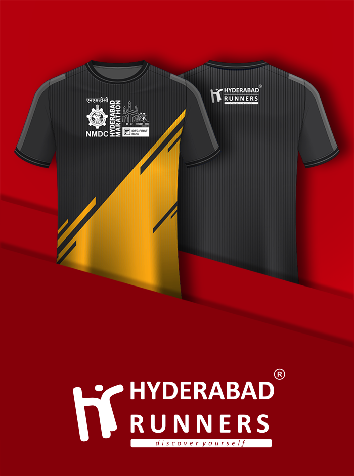
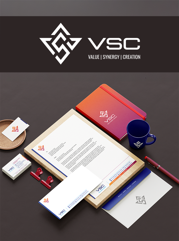
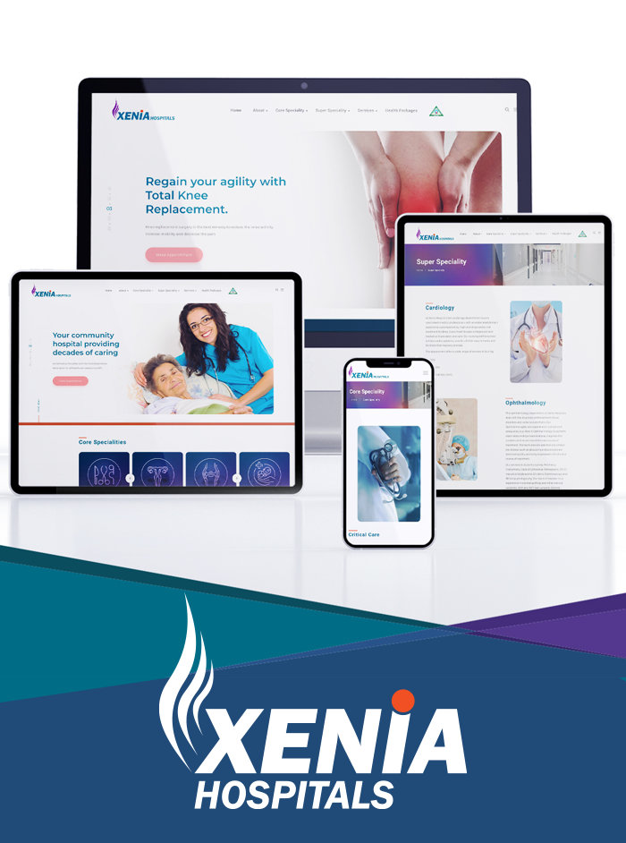
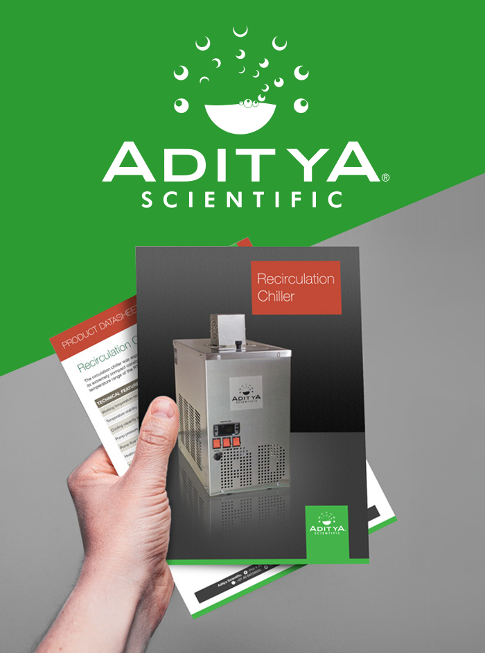
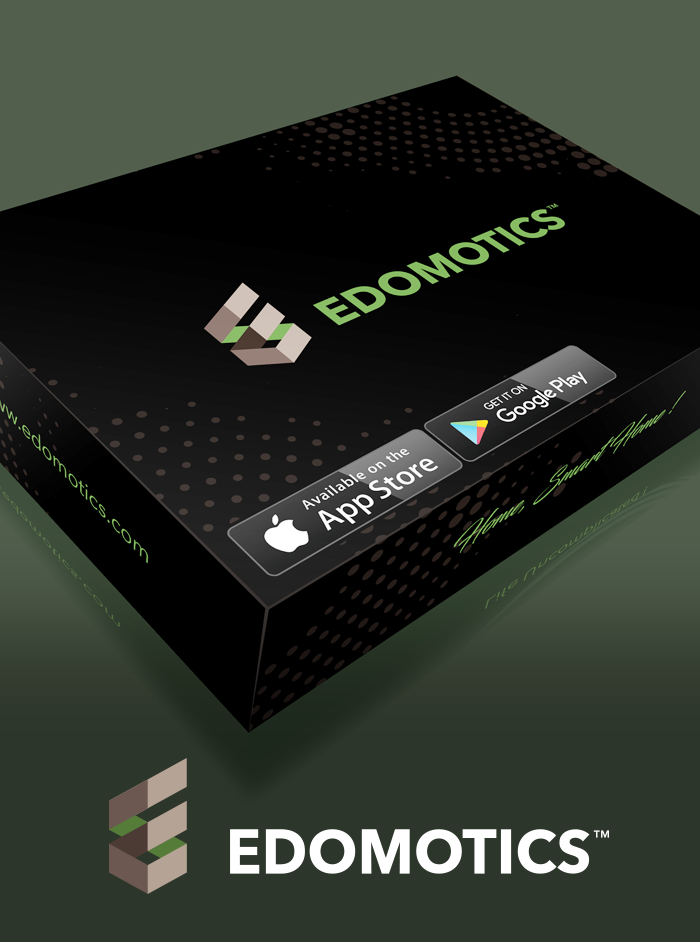
Facebook LinkedIn Instagram Twitter YouTube
Brand
Experience
& Creative
Design
User
Experince,
Web &
Application
Design
Social
Media &
Marketing
Content
Marketing
& Copy
Writing
Logo-Concept

Logo-Drawing

Final-Logo-Face

Logo-Orientation

Colour-Palette

Typography

Responsive-Web

Stationery

VSC GROUP - VALUE. SYNERGY. CREATION

VSC Group is a business consultancy firm serving clients in India and overseas across sectors and business functions and helping them unlock superior value growth and strategic turnarounds.

Having worked for many years in cluttered and fragmented markets, VSC wanted to stand on the precipice of a fundamental change, seize infinite opportunities, and compete against the likes of global consulting firms while embodying promoter’s diverse thoughts and insights.

BUSINESS NEED
To create an Identity that stands for legacy, strength, and stability.
  • Rebranding
  • Brand Guide
  • Product Messaging & Positioning
  • Website Design & Development
  • SEO
  • Corporate Profile

EVOLUTION OF LOGO
VSC stands for Value, Synergy, and Creation. Taking a cue from these three keywords, we wanted to depict an artwork where the three alphabets ‘VSC’ stand out and at the same time be tightly integrated to showcase one-stop solutions for all businesses. The artwork also portrays Lord Ganesha which symbolizes knowledge and wisdom. The gradient colour theme and arrows represent vibrancy, unlimited potential, progression and propelling upward movement.

IMPACT
  • Global Appeal to the Brand
  • Digitally strong & future-ready
  • Standardization of Brand across all communication channels
  • Ready to explore inorganic growth through collaborations & partnerships  

VSC Group is now ready to write the next chapter in the business consulting space in the markets it operates powering their clients’ long-term values & profits and overcoming the profound challenges businesses face.

#brandidentity #brandmessaging #brandpositioning #websitedesign #trademarkregistration #stationary #corporateprofile 


objective

goals

Logo brand

Logo inspiration

logo drawing

logo

logo

typography

logo safe

variations

website


Tiger Auto - The last mile leap

Being at the cusp of the transition phase, India's electric automobile vehicle industry has an opportunity to strategize a sustainable transformation. At this stage, it is imperative that we have companies that can deliberate upon a lasting sustainable transformation.

Smart vehicles are the future of the automobile industry as consumer trends continue to move towards them. With the technology still in its primal stages, it is a field as yet unspoiled, meaning the stakes for innovators and manufacturers are high. 

Enter Tiger Auto, India’s first company to introduce Smart Vehicle Technology in commercial vehicles.  It combines EV solutions and enterprise mobility to deliver last-mile connectivity solutions integrating AI and the Internet of Things (IoT). 

The problem statements:
  • to create a global brand and position Tiger Auto as a technology-driven company
  • with so much energy and resource being poured into creating a unique offering, build excitement and anticipation within the targeted audience
  • formulating a clear and concise positioning statement to bring the concept of last-mile drive and last-mile delivery to life

Tiger Auto worked closely with Multiples Consulting (MC) to give itself a global appeal:
  • MC crafted a top-notch Brand Identity with a complete style guide that will give wings to compete with EV players and resonate in each of the worldwide markets
  • We defined Brand Messaging and Brand Positioning which will lead the way in unlocking the behaviour of the EV commercial industry and opportunities therein.
  • Best of the UI/UX designs for the website for a responsive and dynamic portal.
  • The Whole bunch of stationery and marketing assets like the corporate profile were defined which will help Tiger Auto establish brand consistency across all channels. 
  • Efforts towards Trade Marking proprietary innovations were also initiated to safeguard the interests. 

Tiger Auto is now ready to disrupt the market in India, at the same time identify opportunities in reshaping the EV market across the border.

#brandidentity #brandmessaging #brandpositioning #websitedesign #trademarkregistration #stationary #corporateprofile 


objective

goals

Logo brand

Logo inspiration

logo drawing

logo

logo

typography

logo safe

variations


Xenia Hospitals

With its proficient, empathetic and qualified team of medical professionals, Xenia Hospitals is acclaimed as the safest and the most dependable destination for all healthcare needs for over a decade. As the market suddenly mushroomed with many hospitals and there is sizable competition, Multiples Consulting came on board to strengthen Xenia’s digital presence, attract new customers and reconnect with existing customers.

Business Need:
  • To strengthen the leadership position in the North East part of Hyderabad
  • To rebrand and regain the lost ground in the highly competitive market
  • To promote core services and establish as a holistic solution provider
  • To nurture the existing clientele and establish a Brand Recall

Digital Marketing Solution:
  • Clear definition of Brand identity and Brand guide for maintaining consistency
  • Defined Brand Messaging and repositioning to establish a strong value proposition
  • Built an SEO-enabled, responsive website with UI/UX experience
  • Standardization of MARCOM across various channels
  • Activated social channels for better engagement
  • Leads nurturing programs, promotional videos, health packages and other marketing collaterals

With the rebranding initiative along with Multiples Consulting, Xenia Hospital is now well equipped to discover newer and better ways to deliver the finest patient-centric care, cherishable and non-regrettable experience to the patients.

#brandidentity #logodefination #womenatwork # #colorpalette #websitedesign #responsivewebsite #design #concept


objective

goals

Logo brand

Logo inspiration

logo drawing

logo

logo

typography

logo safe

variations

logo on metal

rudra coffee mug

stationery

rudra tshirts

Rudra stationeries

Rudra Magnets - A revolution in Industrial Magnets

With over six decades of excellence and experience, Rudra Magnets has gradually emerged as a leading innovator in Industrial Magnets. Leading the family-owned business straight through the steep slope of success, Rudra Magnets consistently strives to offer nothing less than exceptional quality products and services.

  • Continuing as a leading manufacturer of innovative, indigenous goods without having a global brand.
  • Creating a strong market presence as producers of product-centric solutions, competing against MNCs in Europe.
  • Digitally banking its six-decade-long legacy through its website and other marketing communication materials.
  • Having a brand identity that is acceptable and adaptable across global media channels.

Rudra Magnets needed to create a buzz around its brand, embrace and acclimatize the change and facilitate global collaborations, partnerships, and supply chain ecosystems.

Multiples Consulting joined hands with Rudra Magnets to transform its identity.
  • Built a brand that is valued for its dynamism, vibrance, and advanced outlook backed by a six-decade-long legacy.
  • A new identity that stood for strength and stability and reflected a careful balance of retaining nativity while going global.
  • An interactive and attractive website enabled with advanced SEO and dynamic UI/ UX with well-planned solution categorization.

With the new facelift, Rudra Magnets strives to curve its graph towards global expansion with a heart for its indigenous customer base. The brand is spreading its wings to take over the globe as a lead industrial magnetic solution provider on the waves of innovation, dynamism, and trust.

#brandidentity #logodefination #colorpalette #websitedesign #responsivewebsite #design #concept


Cover

About

Logo Sketch

Logo black

Variation

Typography

Responsive website

Variation

Ananya Women @ Work

has been delivering boutique Diversity, Equity & Inclusion (DE&I) services for 8 years with complete conviction to its corporate values and a workplace culture built on dedication and respect. Over the years, the consulting firm has partnered with multiple organizations on their DE&I initiatives and made visible contributions to creating an organization-wide cultural transformation. Ananya is largely acclaimed for its proficiency in curating a more inclusive, equitable, and happy workplace culture that focuses on the growth and agility of the organization.

Over the 8 years of the ride through incessant learning, growth, and impacting lives, Ananya proactively identified that having a strong brand would help them establish an instant connection and a wider reach, especially with an MNC-dominated clientele. They wanted to rebrand and give themselves a complete facelift, strengthen their digital presence, reflect core values and principles and shine on everything that fosters their growth.

They chose to trust Multiples Consulting to curate their rebranding exercise. Amidst the many plausible brand Identity options offered, the Ananya team sealed the deal with their best bet. All their marketing assets including a responsive website, corporate profiles, and stationery were created in alliance with the global standards.

With this rebranding, Ananya leaps to bridge the gap between intent and action, policy and implementation and thrives to become the de-facto partner for all the training, mentoring, and coaching needs of the industry.

#brandidentity #logodefination #womenatwork #colorpalette #websitedesign #responsivewebsite #design #concept


Cover

Branding

Logo Sketch

Logo black

Safe Area position

Logo Type

Do and Dont

Variation

Variation

ISAAYU, The Green Health

Isaayu Farms started with the initiative to create a green and sustainable experience amidst the modern sedentary life. Deriving its name from the Sanskrit word “Isayu”, meaning ‘Fresh’, they strive every day to stay true to their motive and objective.

The aspiration to amplify the practice of home farming and living on freshly harvested greens has driven the organisation to strive for new milestones every day since its inception. Isaayu is committed to the idea- of "more in less", making the entire process of cultivation environment friendly without claiming any exponential effort.

Problem Statement:
  • Isaayu was planning for a fresh and powerful launch in the south Indian industry. As part of this plan, it intended to create a firm brand identity and visibility that would have a convincing imprint on the hearts of its customers.
  • They needed proficient professionals to understand their exact requirements and assist them in curating a powerful identity that can gloriously stand for its key aspects - Homegrown, fresh harvest, environment friendly, more in less space, etc.


Present Growth:
  • Multiples Consulting came on board to help Isaayu take a quick drive into the market by creating a powerful green brand with a fresh and exciting look.
  • Multiples Consulting’s team understood the exact needs and curated a logo that was attractive, recallable and stood for their objective and their sustainable green harvest policy. This newly crafted brand identity met the exact expectations of the management and is also expected to take Ishaayu’s brand to new heights.
  • It gives us immense pride and honour to know that we were able to create a snowball effect for Ishaayu’s green health movement within a very short turnaround time.

#brandidentity #logodefination #greenhealth #isaayufarms #colorpalette


Cover

Branding

Logo Sketch

Logo black

Safe Area position

Logo Type

Do and Dont

Variation

Colour Typography

Packaging

Packaging

Mascot in Action

Mascot in Action

Mascot in Action

Website

Stationeries

Stationeries

Desi Foodees, the brand of Regal Healthy Fine Foods.

Desi Foodees began its journey 12 years ago to reach every house in India with ethnic yet modern, tasty and healthy snacks. Their love for ethnic snacks, sweets and the desire to offer the yummiest snack-munching experience to the customers led them to innovate 100+ ready-to-eat and ready-to-make product variants, all meeting the HACCP and ISO standards.

Challenges:
  • DESI FOODEES as a brand was prevalent in private labels (B2B) but not as much in organized and general trade (B2C).
  • Zero digital - No website, no standardized product packaging, no e-commerce.
  • The current Brand Identity was redundant. Rebranding was the need of the hour.
  • To compete with the likes of Haldirams, Telugu Foods etc.
  • To be able to add new products and stay ahead of the competition.


Solutions:
  • A strong Brand Identity was created to reflect a traditional yet contemporary look.
  • Mascot to make the brand more recognizable and memorable.
  • Brand Guide to standardize the design elements.
  • Built interactive and responsive website with advanced SEO enabled.
  • Dynamic UI/ UX, well planned product categorization and standardized product packaging across various product categories.

Multiples Consulting laid a strong foundation for Desi Foodees Brand for an exponential growth path and we continue to support them with promotional and marketing communications.

#digitalmarketing #design #concept #userinterface #userexperience #newidentity #brandidentity #mascot #tagline #websitedesign #responsivewebsite #productpackaging


Corporate Guidelines

Aditya Scientific Logo

Aditya Scientific Logo Formats

Aditya Scientific Logo Colors

Aditya Scientific Brand

Logo Incorrect Usage

Aditya Scientific Tagline

Product Brochures

Product Datasheets

Aditya Scientific

Aditya Scientific, a leading manufacturer of laboratory equipment was started in the year 2010 with a passion for innovation and integrity. They wanted to be one of the best manufacturers competing with MNCs and part of the exercise is to rebrand their company by capturing their inherent strengths. For being relevant in the Indian market at the same time appeal to international markets, we worked on a whole bunch of deliverables like corporate brand guidelines, new identity concept, and design, tagline, website, product datasheets, SEO, tradeshow readiness program, corporate presentation, social media marketing strategy and execution, email campaigns. We are now the extended arm for Aditya Scientific providing a Digital Marketing support system and we continue to add value every single day.

#digitalmarketing #rebranding #SEO #newidentity #website #styleguide #datasheets


Logo Design

Logo Variations

Website Wireframe

Outdoor Advertising

Social Media

Brochures

Ozone Hospitals

OZONE Hospitals started its journey 10+ years back with a vision to deliver futuristic, affordable healthcare to its patients. The team was meticulously working to be a conjunction of international healthcare standards and affordability through its services.

However, the initial years were quite challenging as they struggled with sinking ROI, poor customer base expansion and revenue generation. To compete with other marquee names in the City, a new management team came on board and decided to realign the brand from the brand, sales, marketing and process-driven perspective. They further decided to outsource the Digital Marketing services to an established team of professionals and to refocus on the core areas of their expertise.

Multiples Consulting was chosen to be the preferred partner of Ozone Hospital in this turnaround journey because of our vivid experience in the Healthcare domain. With a holistic approach, we ran an extensive audit to identify the pain points and proceeded to address them step-by-step. From the core aspects of marketing like creating a new brand identity, tagline, messaging and positioning the brand to designing stationery, corporate presentations, doctors profiles; Our team has effectively executed all of it. With smart social media campaigns that enhanced the brands recall and mind share and SEO, marketing assets, powerful visual communications and outdoor advertising campaigns, Multiples Consulting successfully created the turnaround that the new management aimed for. They have now built a strong foundation to elevate to next level healthcare services and are considered one of the best hospitals in South Hyderabad. We are proud and honoured to be a part of this ongoing journey towards exponential growth and brand recognition.

#digitalmarketing #design #concept #userinterface #userexeprience #websitedesign #outdooradvertising #socialmediamarketing #newidentityconcept #brandidentity


FlashDiner User Flow

Website Wireframe

Website Wireframe

Home Page

Products

Catalogue

Offers

FlashDiner

FlashDiner is a one-stop app enabling the best dining experiences for foodies, with fantastic restaurant listings, their fabulous discounts, bank/club card promotions, and fast online table reservations. FlashDiner was the first one to enter the Indonesian market and sought to cash in on the early entry advantage. There was huge potential for such a business model as Indonesia was one of the top tourist designations and had a variety of cuisines. They needed a strong brand and product marketing and management support right from the design, product management lifecycle, UI, UX, website design, app design, new identity concept and design keeping in mind the local market trends.

We had taken care of all their design needs with the utmost care and with top-class deliverables. Today, FlashDiner is the top-notch brand in the hospitality sector in Indonesia and won many accolades.

#digitalmarketing #design #concept #productmanagementlifecycle #userinterface #userexeprience #websitedesign #appdesign #newidentityconcept #brandidentity


Corporate Brand Guidelines

Pitch Innovations

Pitch Innovations Logo Face

Pitch Innovations Logo Face colour

Pitch Innovations Logo Type

Pitch Innovations combined logo

Pitch Innovations vertical logo

Pitch Innovations logo

Pitch Innovations logo

Pitch Innovations color variations

Pitch Innovations color variations

Pitch Innovations imageries

Pitch Innovations logo usage

Pitch Innovations logo and tag line

Pitch Innovations Website

Pitch Innovations

Pitch Innovations is the first music software company from Bollywood entering the AU/VST plug-in world. Founded by Mr Krishna Chetan, an award-winning music producer/Mixing engineer from Bollywood who had worked on more than 50+ Bollywood projects. PI aimed to deliver tools that improve ways to express music better and open new sound possibilities for the world.

The team approached Multiples Consulting for creating an exclusive and distinctive Brand Identity for PI which reflected various sound possibilities. The other key aspects considered were the basic five nodes in the keyboard, elevating expressions and latest trends in the music industry. We arrived at innovative yet straight forward and direct approach in creating a Brand Identity which appealed to a global audience.

#pitchinnovations #branding #brandidentity #brandguide #tagline #soundpossibilities #brandcommunications #websitedesign #websitedevelopment


Brand Identity

APRERA Logo Design

APRERA Logo Concept

APRERA Logo Concept

APRERA Logo Mark

APRERA Logo Description

APRERA Logo

APRERA Logo Colors

APRERA Stationery

APRERA

APRERA is a regulatory body to ensure transparency and efficiency in the Real estate sector and to protect the interest of consumers in the state of Andhra Pradesh. Though APRERA was a Regulatory body, they always envisioned to be a corporate and were looking to build a strong brand which reflected its authority, boldness, and vibrancy. The main objective was to go beyond the superficial regulatory framework to a larger change thereby aligning to a larger purpose, culture, and values. Our team did extensive research on the regulatory framework and was mindful of other regulatory bodies across the country. We had incorporated some of the best practices while defining the APRERA brand identity. The new brand reflects all facets like authority, consumers' protection, shelter, safety, security, and trust, and having stood apart for over many years, they won many accolades in the industry.

We had implemented various marketing elements like corporate brand identity, new identity design and definition, style guide, presentation template, business card, letterhead, envelope, and other marketing elements.

#digitalmarketing #regulator #strongbrand #newidentity #newtagline #corporatebrandguidelines #styleguide #presentationtemplate #stationery


Edomotics Messaging

Edomotics Word Cloud

Edomotics Logo Mark

Edomotics Logo Configuration

Edomotics Logo Colors

Edomotics Logo Images

Edomotics Color Palette

Edomotics Stationery

Edomotics Packaging

Edomotics Packaging

Edomotics Systems

Edomotics is a market leader in integrated solutions for automation, lighting, and AV Systems. Since the market was overcrowded with small and big players, Edomotics desired to differentiate itself as a thought leader and an integrated solution provider. They wanted to move away from their earlier brand positioning of point solutions, sophisticated, local player to integrated solutions, simple & easy to deploy, national player. We had to capture so many aspects with a simple storyline. To begin with, our team initiated a brand audit followed by brand messaging and brand positioning, a new identity more on the lines of torch bearer, new tagline, style guide with all corporate guidelines to maintain consistency, website, product packaging, and other stationery elements.

Edomotics is an established brand in the south market and to become a strong brand, it had undertaken a long journey, a journey on which it partnered with Multiples to achieve the experience it was looking to provide to its clients.

#digitalmarketing #thoughtleader #facelift #brandmessaging #brandpositioning #newidentity #newtagline #corporatebrandguidelines #styleguide #website #productpackaging #stationery


Corporate Brand Guidelines

Logo Craft - Dr Pradeep Kumra's Ayurveda

Logo Drawing - Dr Pradeep Kumra's Ayurveda

Logo - Dr Pradeep Kumra's Ayurveda

Logo - Dr Pradeep Kumra's Ayurveda

Logo - Dr Pradeep Kumra's Ayurveda

Logo - Dr Pradeep Kumra's Ayurveda

Logo - Dr Pradeep Kumra's Ayurveda

Logo - Dr Pradeep Kumra's Ayurveda

Logo - Dr Pradeep Kumra's Ayurveda Illustrations - Dr Pradeep Kumra's Ayurveda

Website - Dr Pradeep Kumra's Ayurveda

Outdoor Advertising - Dr Pradeep Kumra's Ayurveda

Outdoor Advertising - Dr Pradeep Kumra's Ayurveda

Sationery - Dr Pradeep Kumra's Ayurveda

Brochure - Dr Pradeep Kumra's Ayurveda

Dr Pradeep Kumar's Hospital of Ayurveda

Dr Pradeep Kumar’s Hospital of Ayurveda is a one-stop cure for hard-to-treat diseases. They have successfully uplifted the legacy of the ancient practice of Ayurveda. It teaches one to maintain bodily stability by elevating the mind and consciousness through a healthy lifestyle aided with herbal remedies. Dr Pradeep Kumar’s Hospital of Ayurveda has been associated with Multiples Consulting as their digital marketing partner to reach out its audience across the world.

Multiples Consulting skilfully helped them in their brand identity. We took complete care of product messaging, product positioning and promotion of the brand among all potential customers over the digital terrain. We created an easily accessible website for better and faster lead generation. Many social media campaigns have been held to engage more audiences. Internal branding is a pivotal part of reaching out to people with your brand and we performed the task with absolute perfection.  Our digital marketing team created an attractive tag line for the company as well as designed their stationaries. Multiples Consulting is happy to be a partner in growth for Dr Pradeep Kumar’s Hospital of Ayurveda and witnessing their success.

#branding #brandidentity #tagline #styleguide #stationery #illustrationdesigns #social #website #seo #logo


Logo Drawing

Logo Composition

Logo Composition

Corporate Logo

Logo Colors

TRAGARS

On the  72nd Republic Day of India, TRAGARS, a Hyderabad-based organization of fitness enthusiasts, in collaboration with Hyderabad Runners organized a grand marathon at Shamirpet. The intent of the event was to promote a healthy life amidst the pandemic connecting it to the spirit of patriotism. It provided the athletes of Hyderabad and in several other cities across India the opportunity to render their respect towards the nation through a long fun run.

In the midst of a pandemic, the grandeur and success of the event crucially depended on the success of its contactless propagation. Multiple Consulting took up this responsibility and carried it out with great commitment and professional intellect. Our role as the digital marketing partner of this great event brought upon us the responsibility to take this event to runners across the country as a manifestation of the spirit of patriotism. From creating an attractive logo to designing vibrant t-shirts, posters, flexes and e-certificates, our team executed several fine aspects of the event with great enthusiasm. Our team’s effort was rewarded by the colossal engagement we could grab. There were 200 physical and 300+ virtual registrations and with these 500+ participants across India and the US, the run was seamlessly conducted under the guidelines laid by TRAGARS.  Participants and viewers have highly appreciated the effort and stated how the marathon encouraged the idea of free-spirited running after the long trapped situation of the Covid-19 pandemic. Our extensive social media campaigning successfully attracted over 10000 eyeballs of people who were aware of the event and associated with it online or offline. The event was recorded by several press releases and gained significant recognition throughout the country.  Multiple Consulting was proud to be a part of such an event and we intend to continue using our skills to propagate events with such great causes in future.

#brandidentity #eventtheme #eventmanagement #eventsponsors #posters #banners #flexdesigns #socialmediamarketing #brandambassadors #teesdesign #ecertificatedesign #merchandise


Avantirium Logo

Avantirium Logo

Avantirium Logo

Avantirium Logo

Avantirium Logo

Avantirium Logo

Avantirium Website

Avantirium

Avantirium is into Information Technology services, providing cost-effective solutions for cybersecurity threats and challenges for organizations of every size and type. Avantirium is a promising start-up catering to the US market with the potential to gain major success. With a 25% experiencing data breach in the US, there is a huge market for next-level cybersecurity services that Avantirium provides. They vouched to provide protection from this modern-day crime that takes place over the digital platform. Stepping into the market with an experienced team, Avantirium initiated its journey to strengthen online security for all organizations.

A strong promise like theirs needs strong marketing. Multiple Consulting has therefore taken up the responsibility of leading Avantirium to the market by providing a premium level digital marketing service that would establish the latter as the most brilliant service providers out there. We helped them acquire a strong brand identity by creating their logo designing, website, product messaging, positioning, and other hosting services. Our stationery aids like business cards designing, corporate presentation and others helped them come out as a unique identity in the IT market. Our connection with Avantirium is long and on-going where we have been authorized to serve all their digital marketing needs in the present as well as in the future. The success of this association has already been reflected in their escalated exposure to the global audience as the IT solution providers mitigating cybersecurity challenges.

#brandidentity #logodesign #brandpostioning #brandmessaging #websitedesign #webdevelopment #stationery #corporateprofile #businesscards #websitehosting


Pragati Organics Logo

Pragati Organics Logo Craft

Pragati Organics Logo Craft

Pragati Organics Logo

Pragati Organics Logo Mark

Pragati Organics Logo

Product Promotion

Outdoor Advertising

Stationery

Pragati Organics

Pragati Organics is in the business of growing, processing and distribution of Organic foods throughtheir wholesale and retail stores. They started cultivating organic fruits and vegetables in collaboration with farmers in the villages and slowly diversified into organic processing units for longer shelf life.Their aim was to provide organic food for better and healthy living at the same time affordable.Pragati Organics were scaling up at a rapid pace and needed a strong Brand Identity for exporting their produce.After careful consideration, the team brought us on board to launch their brand in the local and overseas market and we worked on a new theme with a logo concept and definition, brand identity, outdoor advertising, print, and other stationery elements.

#digitalmarketing #newidentity #conceptanddesign #brandidentity #outdooradvertising #print #tagline #logo


Logo Drawing

Logo Composition

Logo Composition

Corporate Logo

Logo Colors

Logo Variations

Logo Color Palette

Stationery

Website Design

Consulting Lexicon

ConsultingLexicon is a futuristic consulting company in the areas of Financial Services, Infrastructure Projects, and Advisory Services. It was an Indian consulting firm for the international markets and the client needed a similar appeal as a brand. After several interactions with the promoters and having studied various consulting firms in the industry, we created a brand identity that was unique by itself.

We delivered a new logo design and concept, website design & development, SEO, presentation template, and other stationeries.

#digitalmarketing #newidentitydesign #newidentityconcept #website #seo #corporatepresentation #stationeries


Website Design

Social Media

Social Media

Corporate Communication

Rohini Foundation

Rohini Foundation is Indian's largest foundation for pediatric oral health care with a “Zero Cavity Mission”. Rohini’s initiative is to see a zero cavity in future and to catch the dental problems early as "prevention is better than cure" by screening underprivileged children from orphanages, government schools, visually challenged and hearing-impaired schools. They also introduced Mobile Clinics, the first-of-its-kind initiative for screening and treatment of oral care in an eco-friendly manner to reach out to the towns and rural areas. 

Rohini Foundation started their journey of zero cavity mission with groundbreaking numbers and wanted to spread wings across the state but didn’t have the platform, enough visibility for the niche initiatives. They hardly had any online presence and a strong digital presence was the need of the hour. Website and various communication channels needed to convey strong and key messages and to be able to capture some of their core strengths. They needed more visibility for the campaigns, to get donations for running campaigns extensively, and to spread their presence across the state.

Multiples Consulting completely transformed the Rohini Foundation into a corporate brand. Facelift & revamp of the website, with new messaging and positioning of the foundation, setting up a payment gateway, SEO, various communication channels reflecting the organization achievements in a true sense and raised the bar by many folds. Social media campaigns were extremely successful and created a lot of buzzes and had a tremendous impact by more volunteers joining hands to support the noble cause and donations came in abundance.

#websitefacelift #paymentgatewaysetup #branding #brandmessaging #brandpositioning #brandrecall #seo #socialmediamarketing #donationcampaigns #brandcommunications


Samruddhi Healthcare

Logo Concept

Logo Concept Craft

Logo Drawing

Samruddhi Logo

Logo Variations

Logo Color Palette

Logo Reverse

Stationery

Samruddhi Healthcare

Samruddhi was a pioneer in healthcare and women's clinics. Started by the first-generation entrepreneurs, they envisioned Samruddhi to be a reputable and strong brand, which would help in expanding to newer specialities and territories. They also aimed to reflect their core values, beliefs, and principles in every single conversation with the customers and develop a brand that can last for a lifetime. Various aspects like healthcare, prosperity, healing were considered in a true sense, and the Multiples team had proposed a new identity, tagline, style guide, business cards, and other stationeries. Their motto was healing hands and caring hearts. Through various deliverables, the storyline was made compelling and brand messaging and positioning truly conveyed the overall vision of the company.

#digitalmarketing #newidentity #newdefinition #newtagline #styleguide #businesscard #stationery


Brochures

3 Fold Brochure

3 Fold Brochure

Arth Design Build

ARTH innovates to improve productivity and sustainability in the built environment through technology & trust. They were participating in a tradeshow and needed an innovative three-fold brochure at a short notice. We designed the brochure highlighting their core and legacy products which were the focus areas at the event, at the same time showcasing all other capabilities of Arth. The event was a great success and was well received by the audience.

#digitalmarketing #branding #3foldbrochure#stationery